The Art of Choosing the Perfect Design and Color Scheme :
Choosing the right design and color scheme for your wedding invitations is truly an art form and a vital step in setting the mood for your special day. Whether you go for classic printed cards, pre-made invitations, or trendy digital options, the design should really showcase your personal style and the theme of your wedding. Pre-made invitations are great for their convenience and quick delivery, often featuring elegant, timeless designs that appeal to a wide range of tastes. On the flip side, digital invitations offer flexibility and are eco-friendly, letting you easily customize colors, fonts, and layouts, plus you can even add fun animations or interactive features.
When picking your color palette, think about the overall vibe you want to create. Soft pastels can give a romantic, delicate touch, while bold jewel tones bring in richness and sophistication. Earthy neutrals are perfect for rustic or minimalist weddings. It’s key to strike a balance with your colors for harmony and readability. The design elements like fonts, graphics, and embellishments should enhance the color scheme without overpowering the invitation.
In the end, whether you opt for digital, pre-made, or fully custom invitations, the aim is to create a cohesive look that offers your guests a lovely first glimpse of your celebration. Thoughtful design choices will make your invitations not just beautiful, but also memorable and meaningful.
wedding invitation design tips :
When you’re picking out your wedding invitation design, it’s important to make sure it truly reflects your theme and personality. Think about choosing elegant fonts, balanced layouts, and colors that harmonize with your wedding decor. Adding unique touches like gold foiling, laser cuts, or ribbons can really elevate the sophistication and help your invite stand out. Don’t forget about readability—keeping the text clear and concise ensures your guests can easily grasp all the details. Aim to blend traditional elements with modern trends for a look that feels both timeless and fresh. This thoughtful balance will create an invitation that’s not only meaningful but also eye-catching, perfectly setting the tone for your special day.
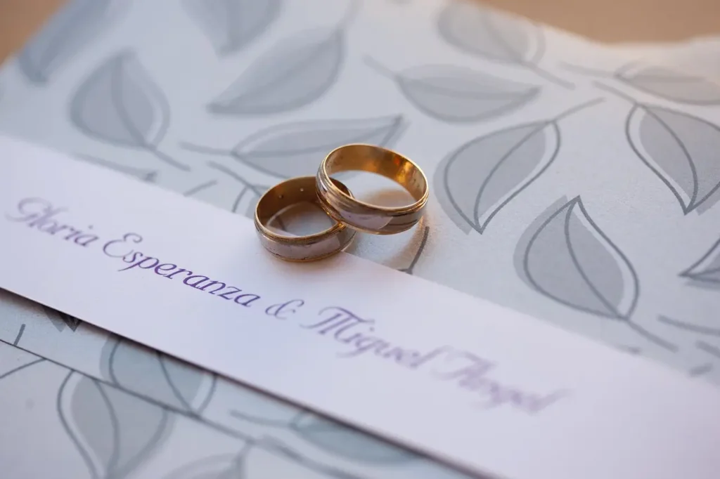
Typography in wedding cards:
Typography is incredibly important when it comes to designing wedding invitations because it really sets the mood for the big day. Elegant script fonts bring a sense of tradition, luxury, and romance, making them a perfect choice for classic weddings. On the flip side, clean sans-serif fonts offer a sleek, modern vibe that works wonderfully for contemporary themes. By thoughtfully combining different fonts, you can strike a balance between style and readability, ensuring that the text is not only beautiful but also easy to read. Paying attention to typography choices can elevate the overall design, adding a touch of sophistication and personality. From the headings to the body text, every little detail counts in crafting an invitation that feels truly special and visually captivating.
color palettes for invitations :
Choosing the perfect color palette is essential for setting the mood of your wedding. Soft pastels can create a sweet, romantic atmosphere, while deep jewel tones add a touch of luxury and sophistication. Earthy neutrals are fantastic for rustic or minimalist themes, bringing in warmth and simplicity. Aim for two or three complementary colors to maintain a balanced and harmonious design. It’s also wise to think about the season and any cultural significance tied to your color selections. This thoughtful approach ensures your invitations are not only beautiful but also meaningful, seamlessly tying together the entire wedding theme.
matching themes with invites :
Matching your wedding invitations to your theme can really enhance the experience for your guests, making it both seamless and unforgettable. Your invitation is like a sneak peek into the celebration, setting the mood for what’s ahead. If you’re planning a romantic garden wedding, think soft pastels, floral patterns, and elegant script fonts. For a rustic vibe, earthy tones, kraft paper, and twine accents work wonders. If modern minimalism is more your style, go for clean lines, neutral shades, and simple sans-serif fonts. And for those luxurious weddings, rich jewel tones, metallic foiling, and intricate designs are the way to go. Even if you opt for digital or pre-made invitations, you can still customize colors, patterns, and elegant finishes to ensure everything looks cohesive.

“A prenuptial agreement is a smart move for couples. Everything you need to know is in this link: https://helloprenup.com/prenuptial-agreements/protecting-support-from-your-parents-in-a-prenup/“